Ten Minutes Is Enough: Designing Health Apps for the Gaps in a Day
A day has 1,440 minutes. Ten of them is less than one percent.
It is a small number, and it is the one we keep in mind when we design a screen. Most people will not give a health product an hour. They will give it the ten minutes that happen to be left over: the end of a queue, the middle of a commute, the quiet stretch after the dishes are done and before sleep.
That is the budget. This post is about what happens to a product when you take it seriously.
The day is already full
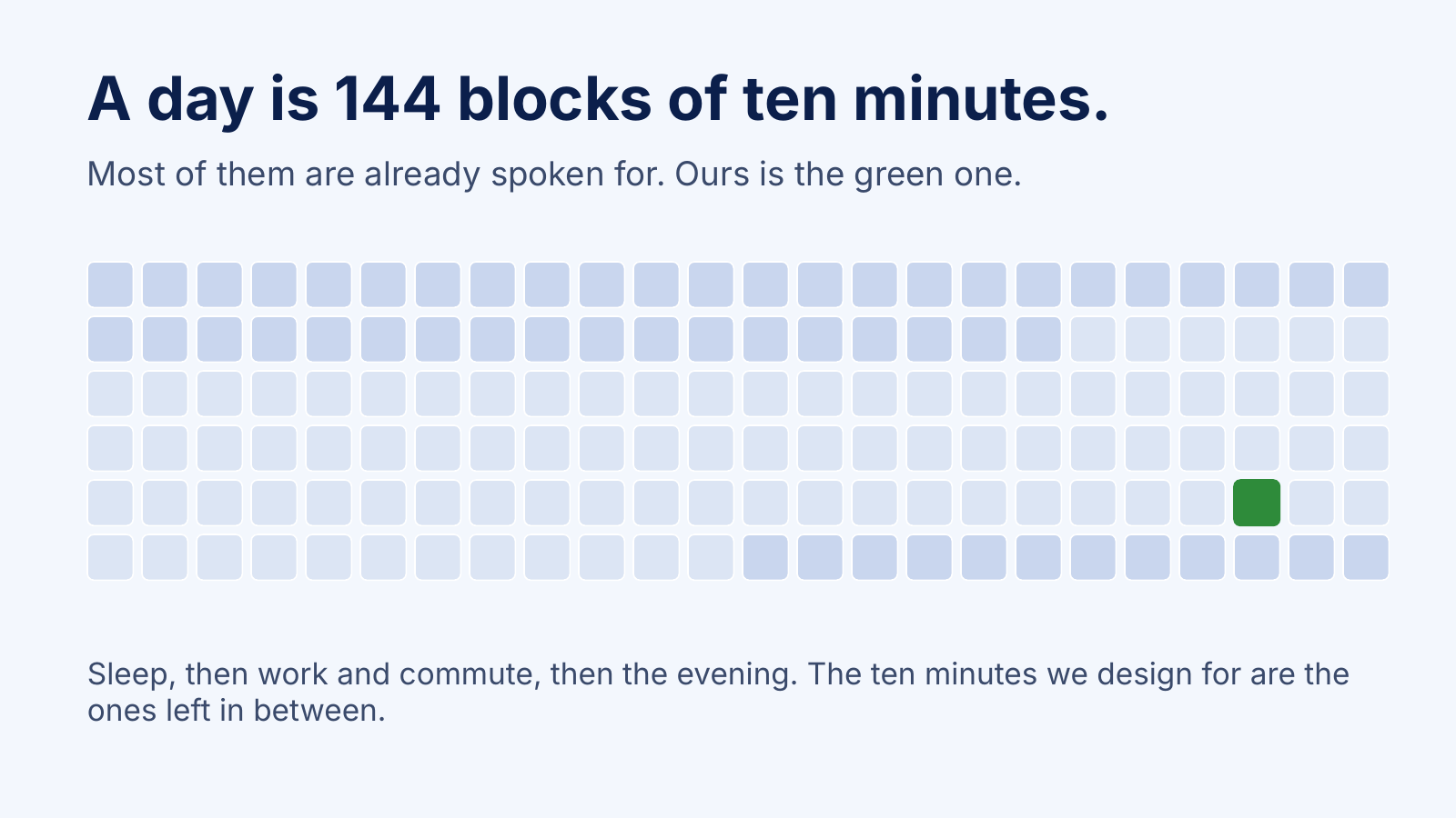
Draw a day as blocks of ten minutes and you get 144 of them. Sleep takes around forty. Work, school, caring for family and getting from one place to another take most of the rest. What remains is a scattering of small gaps, and none of them are announced in advance.
Health habits have to fit into those gaps, because there is nowhere else for them to go. A product that needs a clear half hour and a calm mind is competing with everything else in someone's life, and it usually loses. The loss is not a character flaw in the user. It is a design problem in the product.
What we ask of every feature
When a feature is proposed for Tanaya, RiteFood, MenGO or OneHealth Digital, we ask one question before anything is drawn: what can a person finish in ten minutes?
If the answer is "set up a reminder, check the plan for tomorrow, write down how today went", the feature is probably in good shape. If the answer is "start the process and come back to it", we look harder. Sometimes the feature needs to be split in two. Sometimes it needs to lose half its fields. Occasionally it needs to go.
A few rules fall out of that question.
Start where the person left off. Ten minutes is not enough if the first three are spent finding your place. A screen that remembers what you were doing, and offers to continue, gives that time back.
Ask for one thing at a time. A long form is a decision to be tired. A short question with a sensible default is a decision to carry on. We would rather ask five small questions across a week than twenty on the first day.
Make the useful part the first part. The thing someone came to do should not sit behind a welcome message, a tour or a settings prompt. If they have ten minutes, the first minute is the most expensive one.
Let it be unfinished. A person who has to stop halfway should find everything saved when they come back. Nothing is more discouraging than losing the work of a rare quiet moment.
Why the budget is also an honesty check
A ten-minute rule has a useful side effect: it exposes features that exist for the product's benefit rather than the person's.
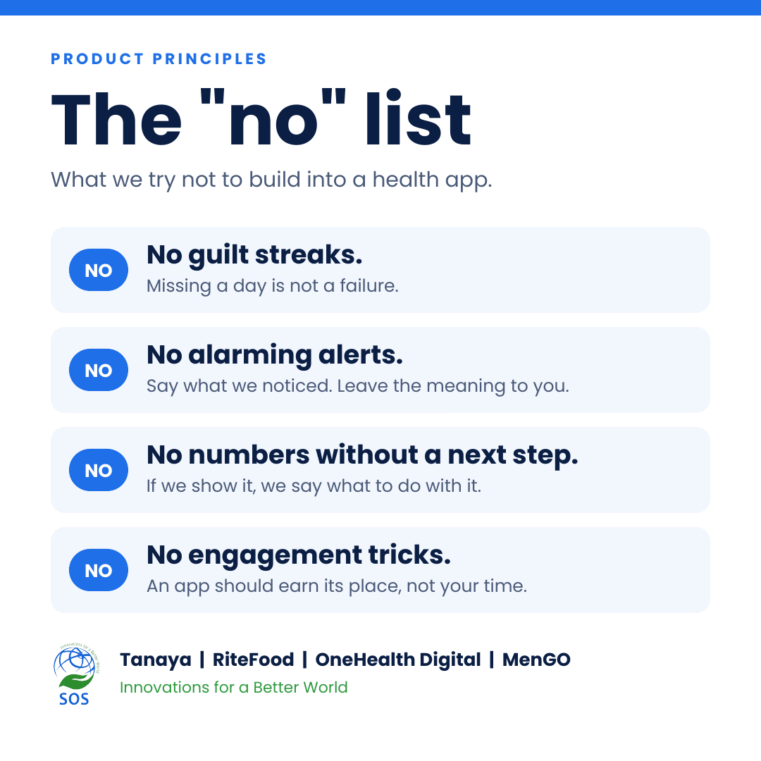
An engagement streak asks for a visit every day. A badge asks for a visit to collect it. A notification asks for a visit because the app has gone quiet. None of them pass the question, because none of them help someone finish something that matters to them. They only help the product feel busy.
We would rather a person open the app, do what they came to do, and close it. If that takes four minutes instead of ten, the design has done its job. Health is not improved by time spent inside an app. It is improved by what happens in the rest of the day.
Small gaps, not small ambitions
None of this means the products are shallow. A women's wellness companion has a great deal to hold: history, cycles, reminders, summaries to share with a doctor. A nutrition platform has recipes, plans and food partners. A hospital platform has appointments, records and follow-ups for people with a great many other things on their minds.
The ten-minute budget is not a limit on what a product can offer. It is a limit on what it asks of someone at any one moment. The depth stays. The way in gets shorter.
What we still get wrong
We do not always manage it. Sometimes a flow that felt tidy in design review takes fifteen minutes with real hands and a real phone. Sometimes a label that made sense to the team does not make sense to a tired person on a bus.
That is why we like hearing from people who got lost. A wrong tap, a missed button or an unclear sentence is information we cannot get from the inside, and it is the quickest way to find the places where ten minutes turned into twenty.
A question to take away
If you build products, try the budget on one screen this week. Pick a task, set a timer for ten minutes, and hand the product to someone who has never seen it. Watch where the minutes go.
If you use health apps, notice which ones respect the gaps in your day and which ones expect you to rearrange your day around them. The first kind tends to be the one you are still using in six months.
A day has 144 blocks. Our job is to make good use of the one we are given.